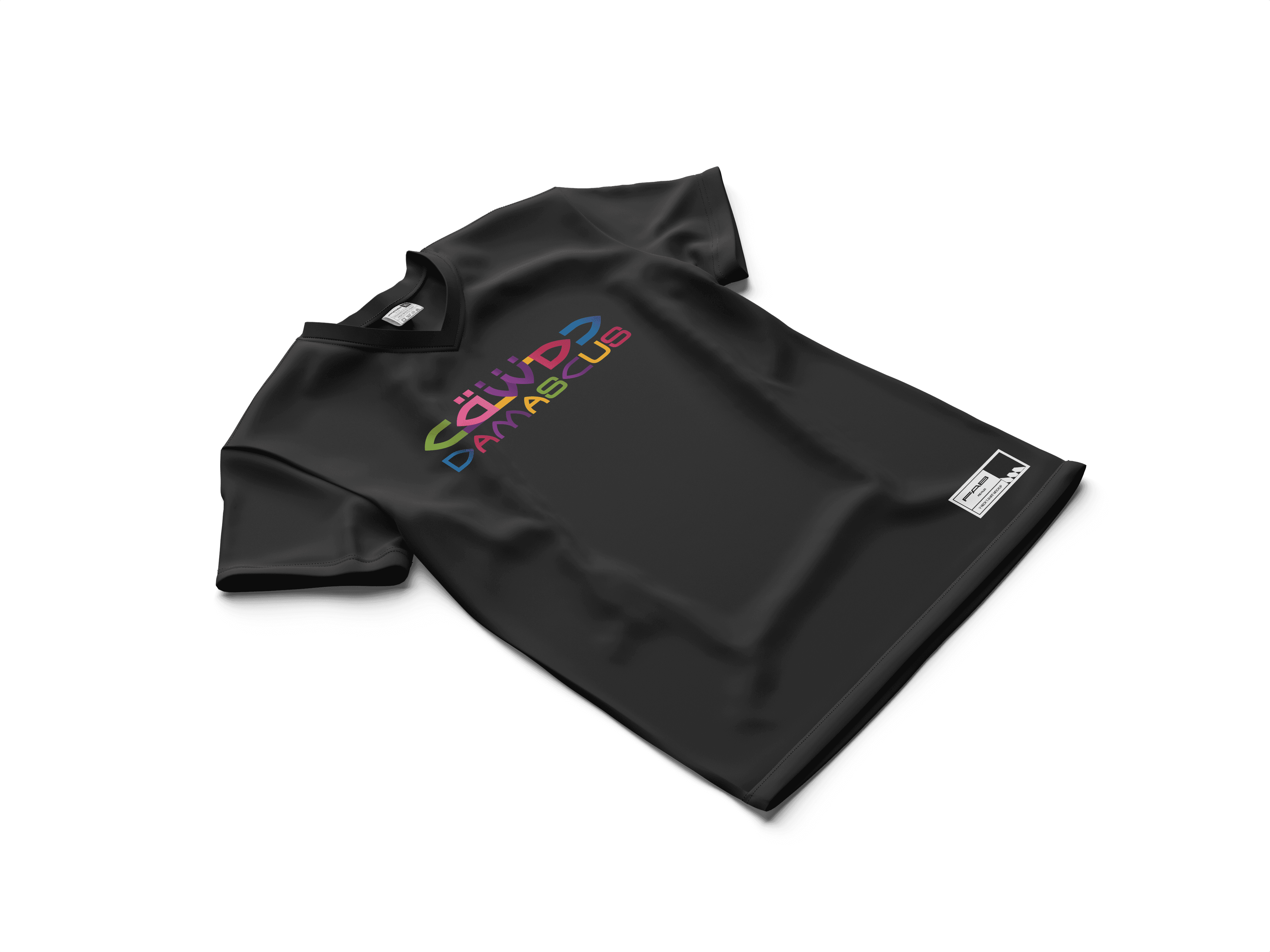
CITY OF DAMASCUS BRANDING
CITY OF DAMASCUS BRANDING
CITY OF DAMASCUS BRANDING
Year
2021
Year
2021
Year
2021
Type
Branding / Visual Idintity
Type
Branding / Visual Idintity
Type
Branding / Visual Idintity
Timeframe
8 weeks
Timeframe
8 weeks
Timeframe
8 weeks
Overview
Overview
Overview
Damascus — one of the world’s oldest continuously inhabited cities — required a visual identity that honors its deep historical layers while remaining modern and adaptable. The goal was to create a symbol both meaningful and minimal.
Damascus — one of the world’s oldest continuously inhabited cities — required a visual identity that honors its deep historical layers while remaining modern and adaptable. The goal was to create a symbol both meaningful and minimal.
Damascus — one of the world’s oldest continuously inhabited cities — required a visual identity that honors its deep historical layers while remaining modern and adaptable. The goal was to create a symbol both meaningful and minimal.
/01
/01
/01
Challenge
Challenge
Challenge
How do you capture thousands of years of civilization, cultural intersections, and spiritual symbolism — all within a simple, scalable logo? The design needed to respect the city’s weight while offering a forward-looking, inclusive tone.
How do you capture thousands of years of civilization, cultural intersections, and spiritual symbolism — all within a simple, scalable logo? The design needed to respect the city’s weight while offering a forward-looking, inclusive tone.
How do you capture thousands of years of civilization, cultural intersections, and spiritual symbolism — all within a simple, scalable logo? The design needed to respect the city’s weight while offering a forward-looking, inclusive tone.
/02
/02
/02
Approach
Approach
Approach
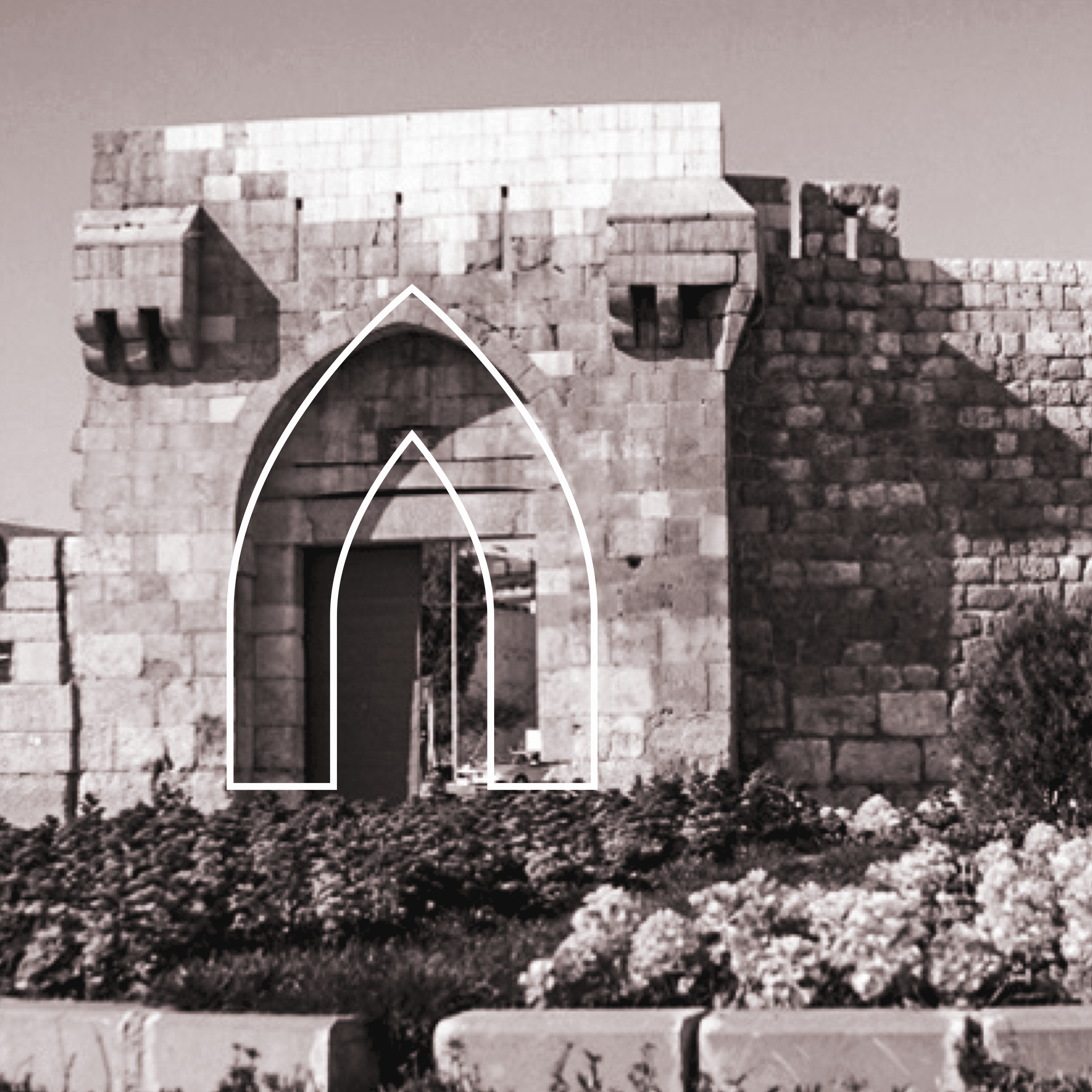
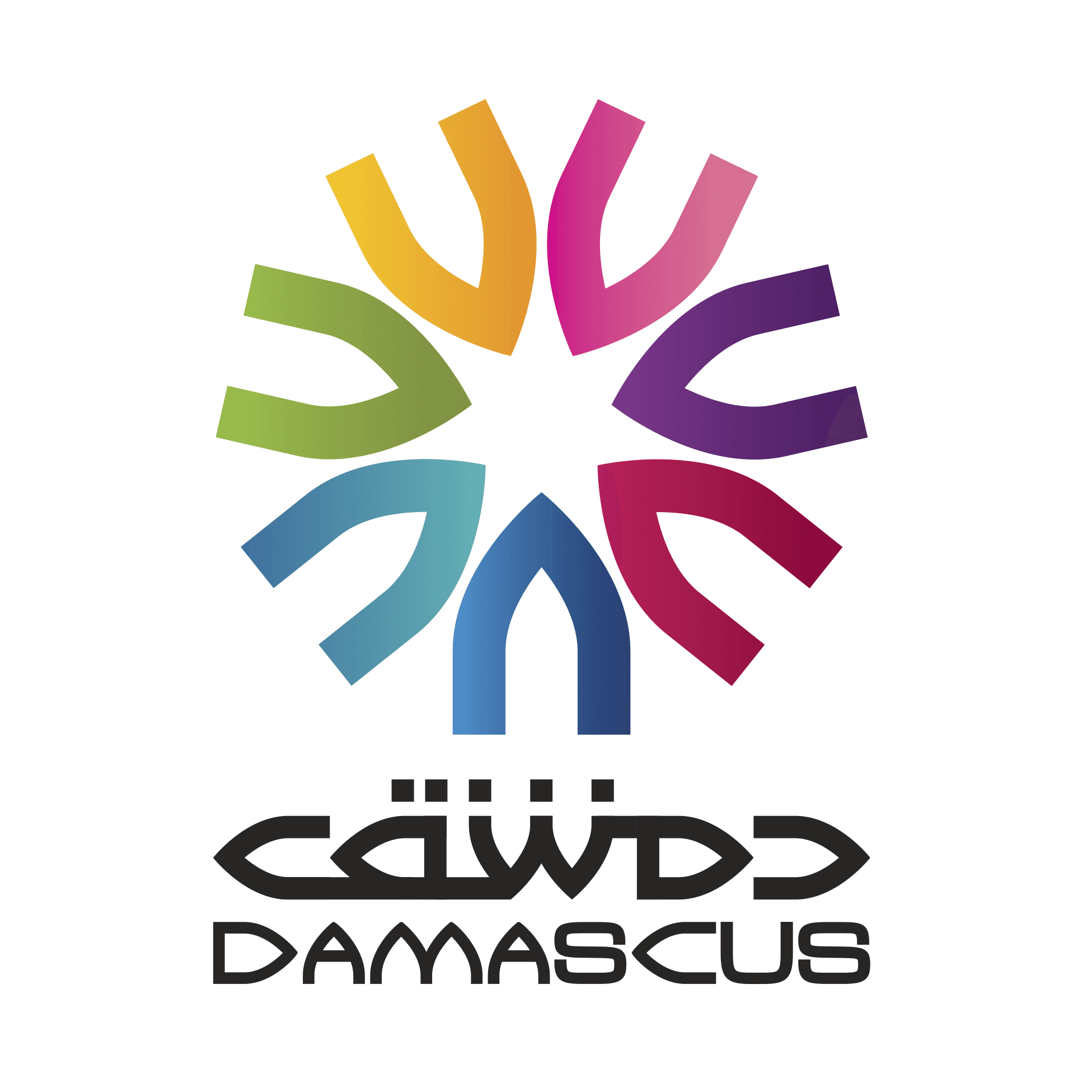
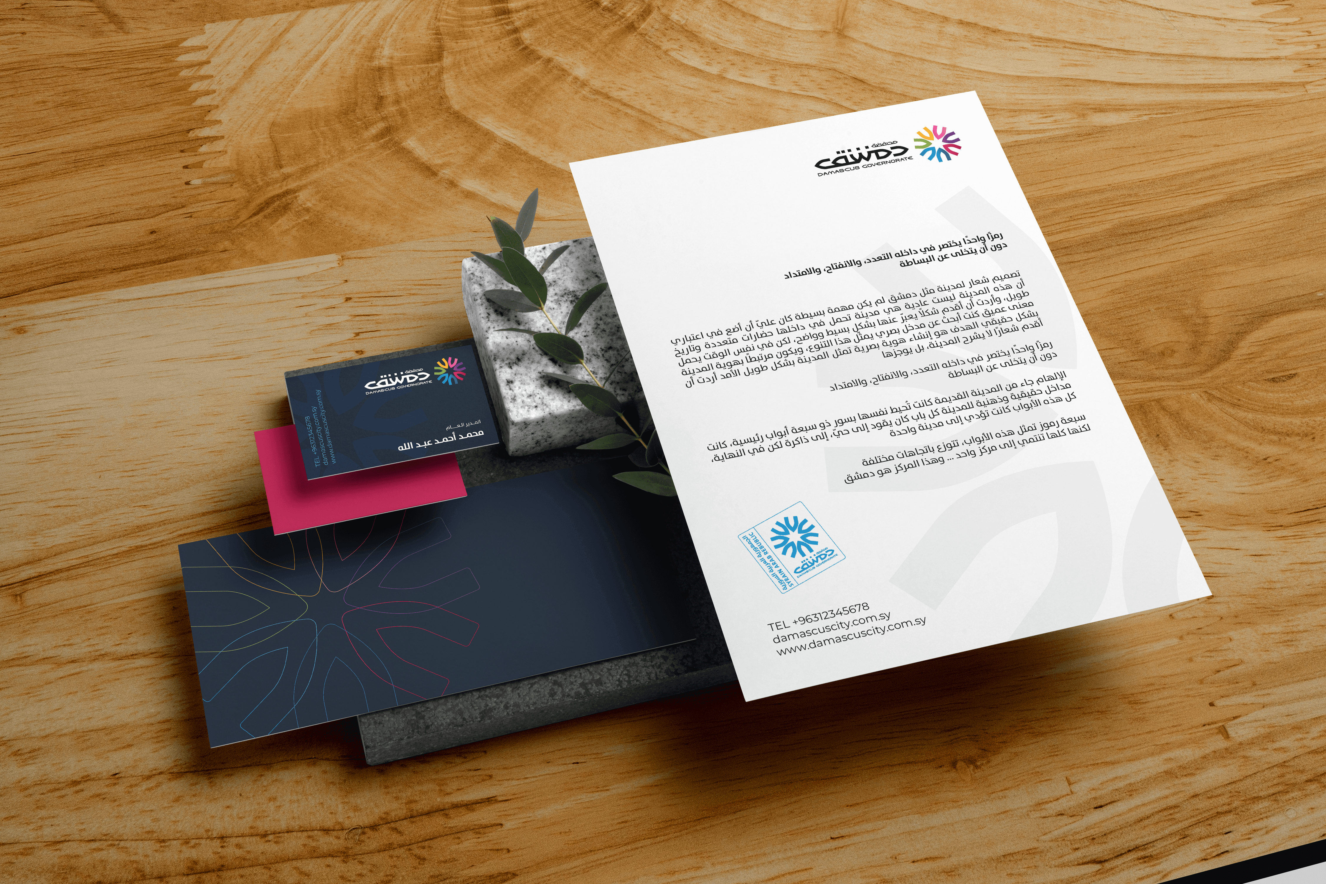
Drawing inspiration from Damascus’s seven historic gates, I crafted a modular geometric form repeated seven times around a central point — symbolizing unity through diversity. Each segment points inward, signifying cultural convergence, and outward, symbolizing openness and connection. The result is a balanced emblem — simultaneously structured and spiritual.
Drawing inspiration from Damascus’s seven historic gates, I crafted a modular geometric form repeated seven times around a central point — symbolizing unity through diversity. Each segment points inward, signifying cultural convergence, and outward, symbolizing openness and connection. The result is a balanced emblem — simultaneously structured and spiritual.
Drawing inspiration from Damascus’s seven historic gates, I crafted a modular geometric form repeated seven times around a central point — symbolizing unity through diversity. Each segment points inward, signifying cultural convergence, and outward, symbolizing openness and connection. The result is a balanced emblem — simultaneously structured and spiritual.
/03
/03
/03
Results
Results
Results
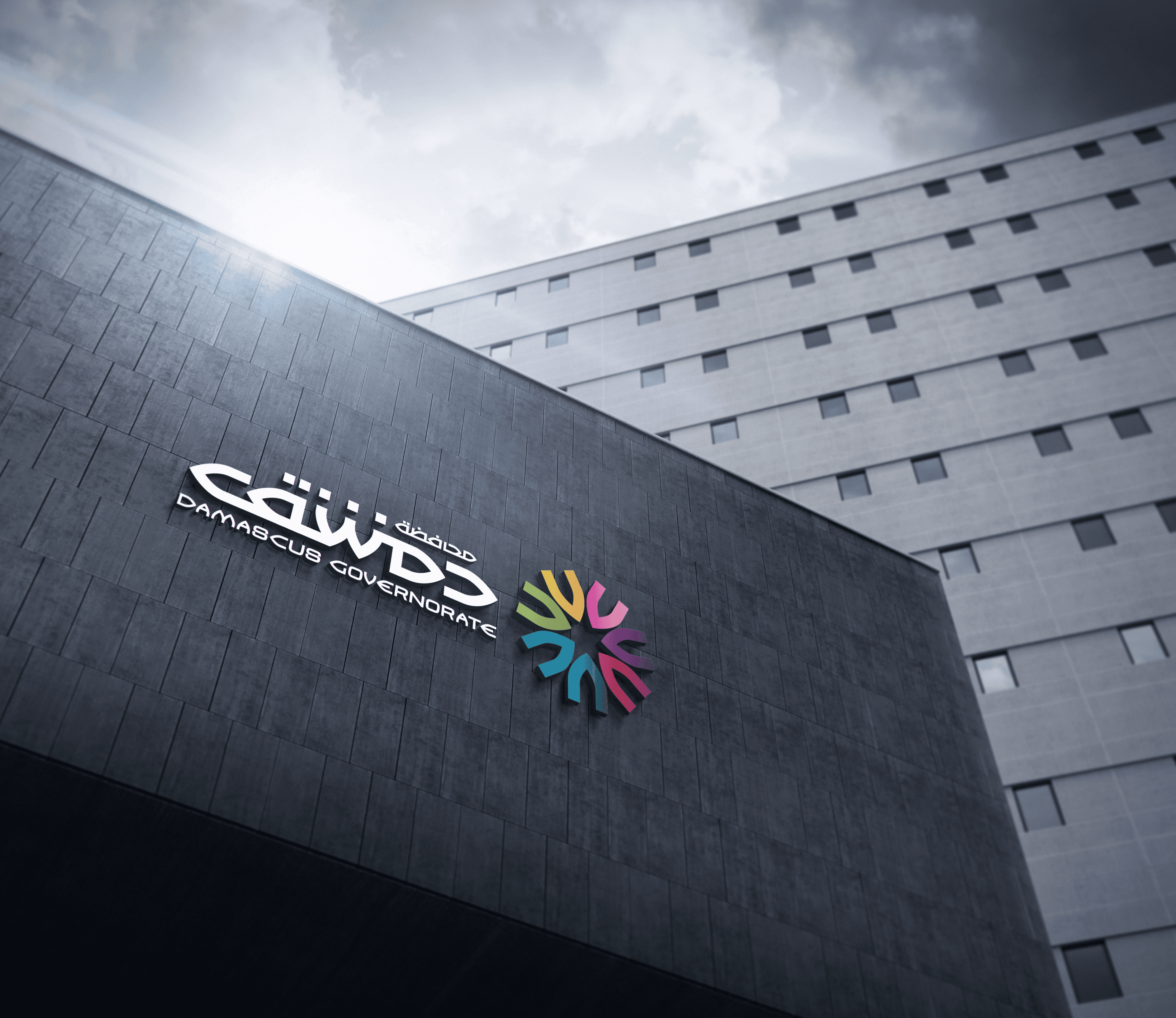
The final mark is a timeless, symmetrical logo that speaks without words — a visual meditation on heritage, continuity, and the enduring soul of Damascus.
The final mark is a timeless, symmetrical logo that speaks without words — a visual meditation on heritage, continuity, and the enduring soul of Damascus.
The final mark is a timeless, symmetrical logo that speaks without words — a visual meditation on heritage, continuity, and the enduring soul of Damascus.
/04
/04
/04
True identity doesn’t always need to narrate — sometimes, it just needs to resonate. This logo was designed not to explain Damascus, but to feel like it.
True identity doesn’t always need to narrate — sometimes, it just needs to resonate. This logo was designed not to explain Damascus, but to feel like it.
True identity doesn’t always need to narrate — sometimes, it just needs to resonate. This logo was designed not to explain Damascus, but to feel like it.